Mobile Menu

Analysis on the global opioid crisis

The opioid crisis in the US has escalated in recent years, with over 81,000 drug overdose deaths occurring in 12 months ending May 2020. This is the highest number of overdose deaths ever recorded in a 12-month period.

Concerning patterns are starting to arise across the Atlantic, where opioid prescription rates in the UK have doubled over the last 10 years. As these two countries face parallel issues, we wanted to analyse how people in the US and UK speak about opioids. 

To illustrate how different a global problem has escalated across two territories, we compared Twitter conversations in the two countries, and our analysis is useful for healthcare agencies decide how communicate to each audience, using their own words and concerns.

Fill in your details on the right to access the findings.

The Olympic rings with sports fan inside them and images of plants and wind turbines on the outside to visualize sports sustainability.

Sports sustainability: How to resonate with fans

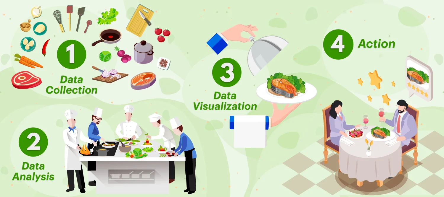
A 4-step process using restaurant food preparation to visualize a CX insights process that enhances dining experience.

Building an analysis process to serve up a great dining experience

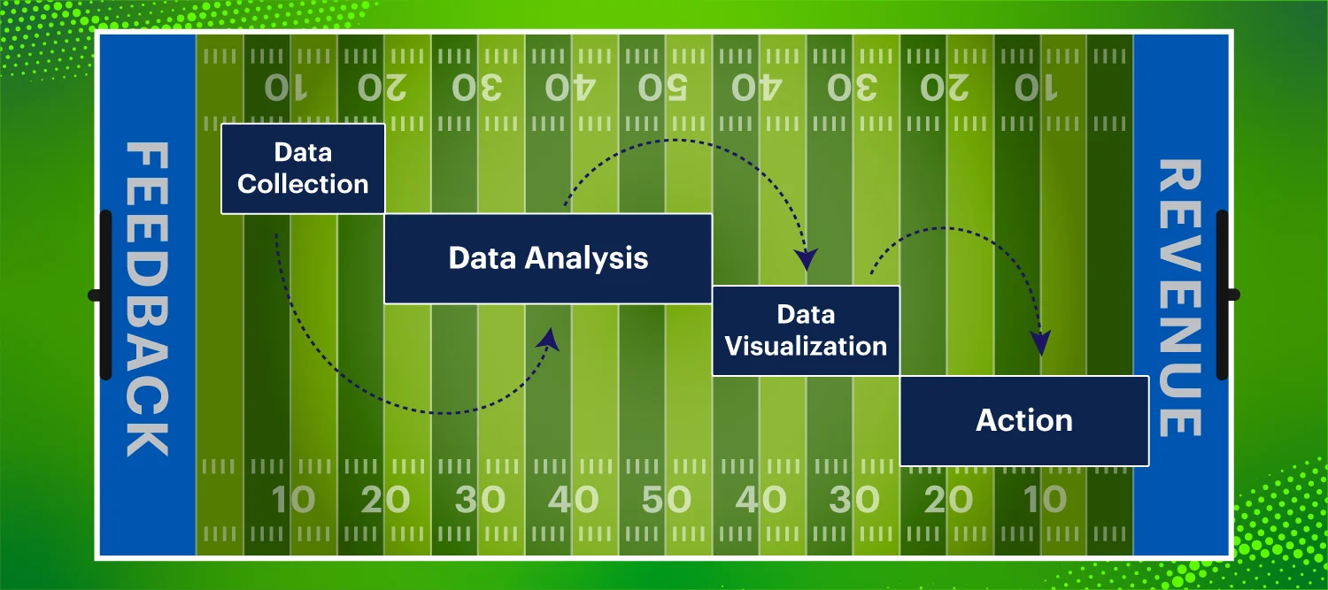
An American football drive chart showing the four steps to enhancing fan experience programs.

Building championship-caliber fan experience programs with repeatable tactics

An image of VP of Sales Rachel Banks alongside dining imagery to illustrate a restaurant customer experience program.

Why a restaurant customer experience program is a vital investment

The four biggest challenges in building AI text analysis solutions

The Golden Gate Bridge with jeans replacing the water to showcase a blog about the in-store experience for Levi's San Francisco store.

Identifying what customers think about Levi’s in-store experience

Rauri Hadlington talks to the SportsPro Podcast about improving gameday experience.

Rauri Hadlington: How to enhance fans’ gameday experience

Red and green lines surrounded by like and dislike icons in code segments to visualize sentiment coding.

Sentiment coding in free text responses – harder than it sounds?