Understanding your competitors with Heatmaps text analysis visualization

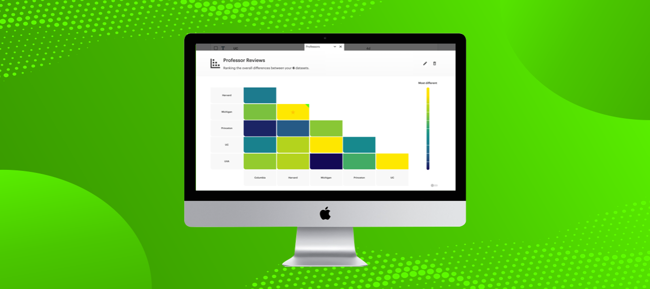
Relative Insight Heatmaps is a text analysis visualization tool that helps insight teams, market researchers and strategists quickly spot which pairs of data sets in a group are most and least different, across competitors or target audiences.
Heatmaps provide a top-level view of your market and customers. It is a rapid solution for generating audience and competitor analysis insights, while supporting effective data storytelling and presenting a visualization of your text analysis. The tool also plays a valuable role in helping teams focus on the things that matter most in their data and prioritize specific areas for further analysis.

Visualize your competitor and target audience text data in minutes
Heatmaps can quickly show an overview of your competitors and target audiences. Designed to be a part of any research output, Heatmaps are particularly useful when working to produce insights for a pitch on short notice.
By uploading customer reviews of competing products to Relative Insight and visualizing this data using Heatmaps, insight teams can quickly survey the competitor landscape. This enables organizations to easily identify the brands to which they are most closely aligned and those that are most differentiated. Equipped with a strong understanding of their competitive position, marketing and sales teams can leverage the most effective messaging to win customers.
Relative Insight customers are also taking similar approaches to understand their target audiences. Segmenting customer feedback based on, e.g. location makes it easy to identify how customer needs and experiences vary across geographic markets. This helps marketers, sales and product teams take an informed approach to localization.
Text analysis visualization for compelling data storytelling
You may find that condensing a complex analysis into a simple form for stakeholders is often a great challenge. With Heatmaps, you can provide a powerful visualization that everyone can understand at a glance.
Including a Heatmap at the beginning of a pitch or report gives context and sets the scene. Providing a high-level view helps get clients and stakeholders in the right mindset before delving deeper. This helps to build confidence and increase the likelihood of insights being used as the basis for decision-making.
Visual representation: The key areas for further analysis
Heatmaps also function as a launchpad for further analysis and exploration. When analyzing large volumes of data, exploring every possible angle is often not practical. By showcasing where the most and least pronounced differences are, Heatmaps help to generate top-line insights and prioritize further investigation.
For example, teams often focus on analyzing similar competitors as they vie for the same consumers’ attention. Heatmaps will show their least different competitors, enabling the analysts to explore them in more detail.
However, when conducting a geographic market analysis, teams might want to examine further the greatest differences. The biggest differentiation will indicate the need for a more localized approach.
Heatmaps as your powerful visualization tool
You can create and view Heatmaps from the Customer Dashboard. Navigate to the project folder and select between three and 20 data sets that you want to include. Then simply click the Heatmap icon in the bulk action menu at the top of the screen.
